
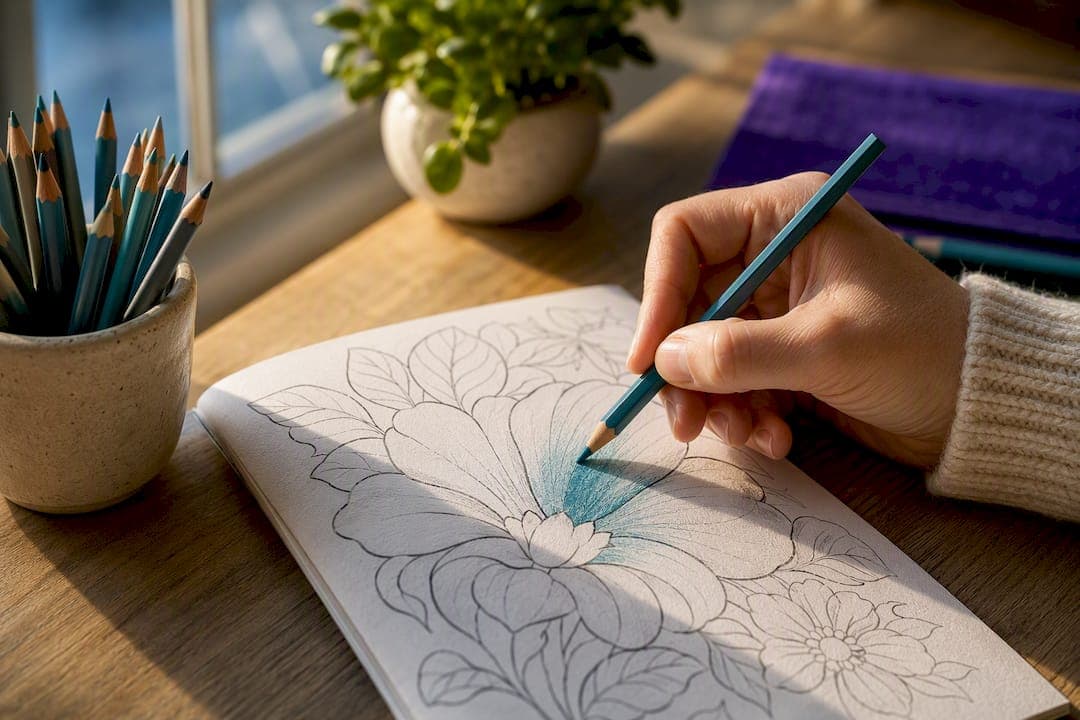
Mark your light source before you pick up a pencil, then build shadows with light layers instead of one heavy pass. That single decision, repeated on every shape, is what separates a flat coloring page from one that looks three-dimensional. From there, the order matters: base color first, shadows built through layering, blending to soften edges, and highlights added dead last with a white pencil or gel pen.
TL;DR:
- Layering with multiple light, translucent passes prevents wax buildup, ensures smooth blending, and avoids muddy or waxy coloring.
- Marking your light source consistently guides shadow placement and helps develop a repeatable shading process.
- Using tools like solvents or colorless blenders requires patience and proper ventilation to avoid paper damage or buckling.
- Highlight placement enhances the three-dimensional illusion, with gel pens ideal for reflective surfaces and pencils for softer effects.
- Practicing on simple shapes like spheres or repeating patterns accelerates skill development more effectively than complex images.
Table of Contents
- What Is Shading in Coloring Books, and Why Layering Comes First
- A 6-Step Workflow for Shading Any Shape
- Choosing the Right Pencils, Markers, and Blending Tools
- Core Techniques: Layering, Blending, Hatching, and Burnishing
- Placing Highlights So Shapes Actually Pop
- Fixing the Mistakes Almost Everyone Makes
- Three Quick Drills to Build Shading Instinct Fast
- What the Research Actually Backs Up
- One Honest Note on Getting Better at This
- Practice These Techniques on Pages Built for Layering
- Sources
What Is Shading in Coloring Books, and Why Layering Comes First
Shading in coloring books means controlling where a color goes light and where it goes dark to fake the presence of a real light source on a flat page. Artists sometimes call this "value control" rather than "shading," and it's worth knowing that term, because it shows up constantly in tutorials and forums. Value refers to how light or dark a color is, independent of the hue itself, and it's the actual variable doing the work when a sphere starts looking round instead of like a colored circle.
Most beginners skip straight to picking a "shadow color" and pressing hard. The better approach, confirmed by illustrator John Muir Laws's layering method, is to apply several light, translucent coats instead of one heavy one. Layering this way avoids wax buildup, keeps the paper's tooth intact for later passes, and blends more evenly than a single hard-pressed layer ever will. It's a slower habit to build, but it's the one technique that fixes the most common shading complaints: muddy color, waxy shine, and blotchy transitions.
A 6-Step Workflow for Shading Any Shape
You don't need a complicated system to shade convincingly. You need the same six steps, done in the same order, every time.
- Pick and mark your light source. Draw a tiny arrow in the margin pointing toward the light. This sounds trivial, but a marked light source is what turns shading from a guess into a repeatable process, according to research on value-based shading.
- Lay a light, even base layer across the entire shape before you touch any shadow areas. This gives you a consistent starting value to build from.
- Build shadows with multiple light passes, working the darkest layers into the areas farthest from your light source. Keep pressure light and even; darkness should come from repetition, not force.
- Blend the transitions with circular strokes, a colorless blender, or a solvent, working from dark toward light so edges soften rather than smear.
- Add highlights last, using a white pencil for soft accents or a white gel pen for sharp, bright points.
- Step back and compare values. Squint at the page. If a shadow and its neighboring midtone look the same shade of gray, add another light layer to the shadow.
This sequence works on a single grape or an entire mandala page. Once it's automatic, you'll shade faster because you're not second-guessing which step comes next. Our step-by-step adult coloring guide walks through this same order with a full page example.
Choosing the Right Pencils, Markers, and Blending Tools
Your tools decide how forgiving your shading process is. Wax-based colored pencils (Crayola, Prismacolor) are softer and blend easily with pressure or a blending stump, but they're prone to a hazy "wax bloom" if you burnish too early. Oil-based pencils (Faber-Castell Polychromos) hold sharper lines through more layers and resist bloom, which makes them better for detailed, layered shadow work.
Alcohol markers only belong on pages printed on marker-friendly, bleed-resistant paper. Thin stock will bleed through and ruin the page behind it, so check paper weight (80 lb or higher is a safer bet) before reaching for a Copic or Ohuhu marker.
For highlights, a white gel pen delivers a crisp, glassy dot, while a white colored pencil gives a softer, matte glow. Choose based on the surface, not personal preference.
- Colorless blender pencils smooth pencil layers without adding pigment.
- Tortillons (rolled paper blending sticks) work well for small, detailed areas.
- Solvents like Gamsol create the smoothest possible transitions, but they need good ventilation and roughly 5 to 10 minutes of drying time before you add another layer, or the paper will smear and buckle.
Pro Tip: Test any solvent or alcohol marker on a scrap corner of the same paper stock first. Bleed-through and buckling show up fast, and a ruined test corner is a lot cheaper than a ruined page.
Core Techniques: Layering, Blending, Hatching, and Burnishing
Four techniques do almost all the heavy lifting in shaded coloring work, and each one solves a different problem.
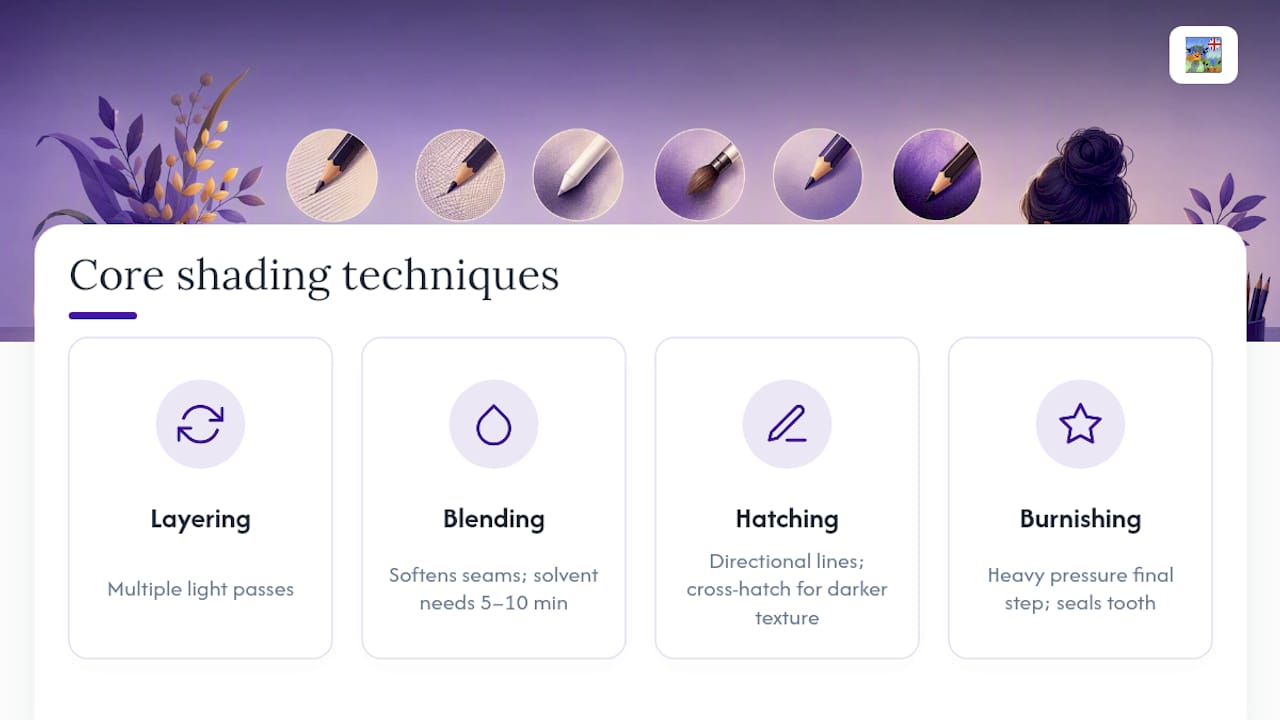
Layering is the foundation. Instead of pressing hard once, you apply the same color in three, four, or five passes, letting each one dry before the next. John Muir Laws's research on colored pencil technique found this approach consistently outperforms single heavy applications for both saturation and blendability, and it's the reason experienced colorists rarely press hard on a fresh page.
Blending softens the seams between layers so shadow and midtone read as one continuous surface instead of two flat zones. Circular strokes work for organic shapes like fruit or skin. Directional strokes, following the grain of fabric or fur, work better for textured surfaces. Solvent blending is the smoothest option of all, but it demands patience.
A quick reality check on timing: solvent blending needs 5 to 10 minutes of drying time before you layer over it again. Skip that pause and you risk lifting pigment or warping the paper.
Hatching and cross-hatching use directional lines instead of solid color to build value. Parallel lines (hatching) suggest smooth surfaces like glass or skin in soft light. Crossed lines at an angle (cross-hatching) build darker values fast and read as texture, which makes them ideal for tree bark, rough stone, or shadowed fabric folds.
Burnishing means pressing hard with a light color, or a colorless blender, to melt every layer into a smooth, glossy finish. It's the technique that makes plastic, glass, and polished metal look convincingly slick. The catch: burnishing fills the paper's tooth completely, so it should be the last thing you do on any given area. Once a spot is burnished, no more pigment will stick to it.
Matching technique to subject matters more than most guides admit. Fabric wants soft hatching and light blending to preserve its texture. Metal wants heavy burnishing and crisp white gel pen highlights for that glassy pop. Skin wants the lightest touch of all, with gentle layering and minimal burnishing to avoid an artificial shine. Structured guides on colored pencil technique sequencing recommend moving through pressure control, layering, blending, and shading in that order for exactly this reason. Skip a step and the final burnish exposes every shortcut underneath it.
Placing Highlights So Shapes Actually Pop
Highlights are the step beginners rush, and it costs them the most visible payoff on the page. A highlight placed correctly, even a tiny one, is often what convinces a viewer's eye that a surface has real depth.
- Use a white gel pen for anything reflective: glass, metal, water, wet eyes. It sits on top of existing color and gives a hard, bright specular dot.
- Use a white pencil for anything soft: skin, fabric, fur, hair. It blends slightly into the surrounding color for a gentler glow, which research on light and shadow rendering links directly to material realism.
- Leave small patches of bare paper untouched near your light source instead of coloring them at all; the white of the page often reads better than any pencil white.
- Test the highlight on scrap paper first. Gel pen ink can skip or blot depending on how saturated the pencil layers underneath already are.
Pro Tip: Add highlights in the very last two minutes of a page, not as you go. It's much easier to judge where a highlight is needed once the shadows around it are finished.
Fixing the Mistakes Almost Everyone Makes
Every beginner makes the same handful of errors, and every one of them has a quick fix.
- Pressing too hard, too early: the color gets dark before you've built any range of values. Fix: back off entirely, switch to a fresh area, and rebuild with lighter pressure and more layers.
- Ignoring your light source halfway through: shadows end up scattered around a shape with no logic. Fix: re-mark the arrow, then walk the shape again, checking each shadow against that one direction.
- Waxy buildup from burnishing too soon: the surface goes shiny and stops accepting new color. Fix: there's no undoing a full burnish, so treat it as a final step, not a mid-process fix.
- Muddy, flat-looking shadows: usually caused by piling on gray or black instead of deepening the base color. Fix: add a touch of the object's complementary color into the deepest shadow, then layer the original hue back over it to restore some life.
Three Quick Drills to Build Shading Instinct Fast
You don't need a finished coloring book page to practice this. A few minutes on a simple shape teaches your eye more than an hour of coloring something complicated.
- The sphere drill. Draw or find a plain circle. Mark your light source, lay a light base, build a core shadow on the far side, add a thin sliver of reflected light at the very edge of that shadow, then drop in a soft cast shadow beneath the circle. This one exercise contains almost every principle in this guide.
- The leaf or petal drill. Pick a simple leaf or flower petal shape. Use directional strokes that follow the vein lines or curve of the petal, layering gradually from the base toward the tip, so the strokes themselves suggest the form.
- The pattern drill. On a page with repeated shapes (a mandala or a tessellated pattern works well), apply the exact same light-source decision to every single shape. Consistency across a repeated pattern is the fastest way to train your eye to see value automatically.
Starting with rounded, simple forms like these lets you see the effect of each pass immediately, which is why tutorials on shading coloring pages consistently recommend spheres and basic fruit shapes before anything more complex. For a page structure built around this kind of repetition, our guide to developing coloring pages breaks down what makes a design practice-friendly in the first place.
What the Research Actually Backs Up
Layering beats heavy single passes for smooth, blendable color. Solvent blending works, but it needs ventilation and a genuine drying pause. Highlights matter more than most guides suggest, and value, not hue, is what makes shading read as convincing.
"You rarely need a new color to shade something convincingly. You need the same color, made lighter or darker." That's the core finding from Jennifer Morrison's writing on value and color, and it's the single idea that simplifies everything else in this guide.
Mark writes on shading technique and page design for Munkterproducts, including the site's coloring trends coverage.
One Honest Note on Getting Better at This
Beginners who improve fastest aren't the ones with the most expensive pencils. They're the ones who mark a light source every single time, even when it feels unnecessary on a simple shape.
That one habit does more for a page's realism than any blending tool ever will. Pick one drill from this guide, the sphere is the easiest starting point, and run through it before your next full page. You'll feel the difference in your pencil pressure within ten minutes.
— Mark
Practice These Techniques on Pages Built for Layering
Technique only sticks once you've run it on a real page, and not every coloring book gives shading room to breathe. Some coloring pages feature open, well-separated shapes that layering and blending require, so your test strokes land where they should instead of bleeding into cramped detail lines.

The Anime Beauty coloring book is built around large, simple planes, hair, skin, and fabric folds, which makes it a genuinely useful place to practice value control on skin and cloth without fighting tiny gaps. The Fairies colouring book leans into varied textures, wings, petals, foliage, so you can move between hatching, blending, and burnishing on the same page and see how each technique reads differently by surface. These books are often printed on stock that holds up to layered pencil work and light marker use.
Pick up the Anime Beauty coloring book and run the six-step workflow on a single face before you tackle a full page.

Sources
The techniques above draw on John Muir Laws's layering method, Ann Richman's solvent blending guide, Jerry's Artarama's guide to light and shadow, and Jennifer Morrison's writing on value. For creative texture ideas beyond pencil work, see The Zoofamily's leaf art techniques.
- Layering & blending colored pencils — John Muir Laws
- How to use solvents with colored pencils — Ann Richman Art
- Mastering light and shadow with colored pencils — Jerry's Artarama blog
- Value is more important than color — Jennifer Morrison Art